An exploration in data visualization, focusing mostly on publicly-available data. Data visualizations based on a wide-range of topics, and updated regularly.
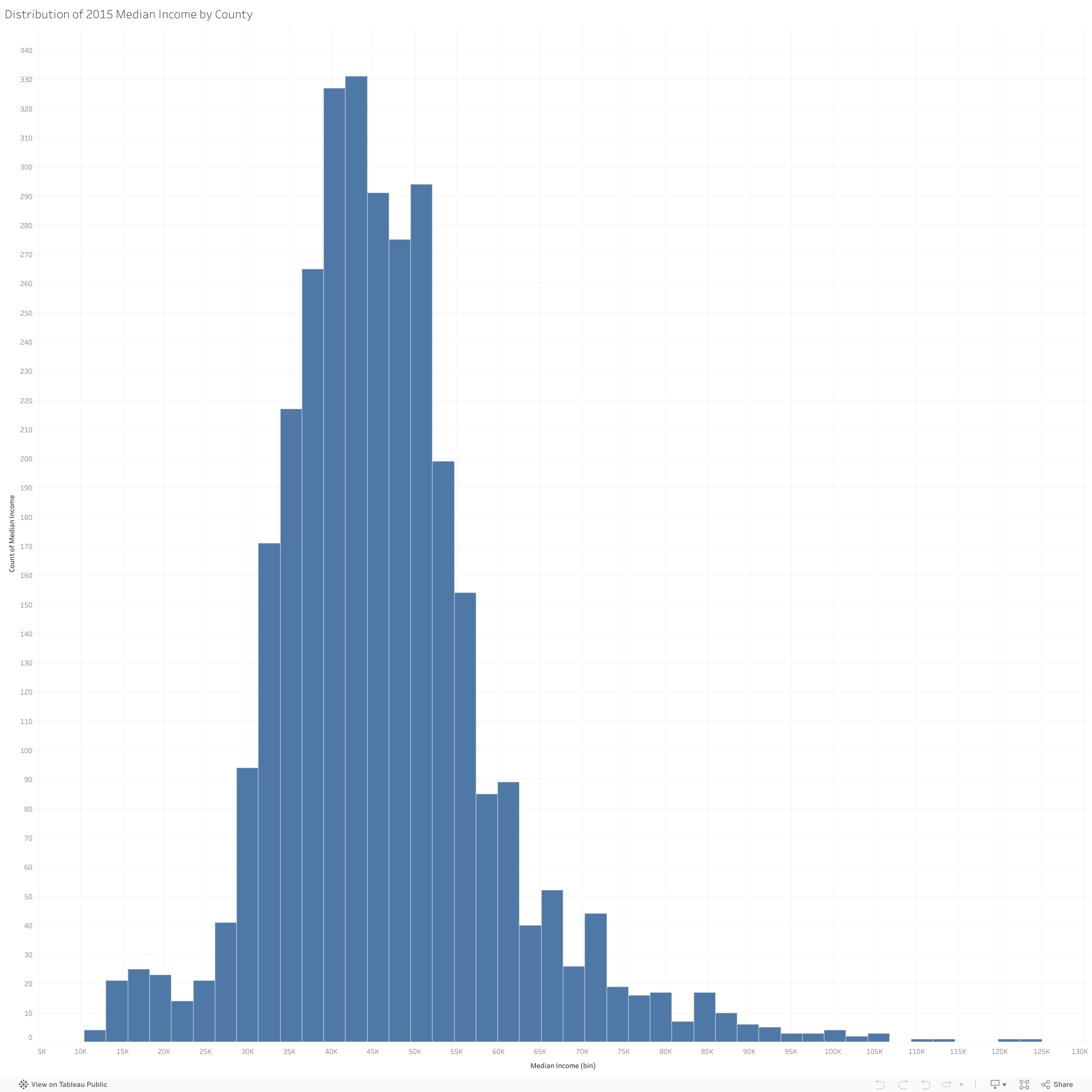
Distribution of Median Income across US Counties in 2015. Details are shown for Median Income by County. The data comes from the Fact Finder of the US Census.
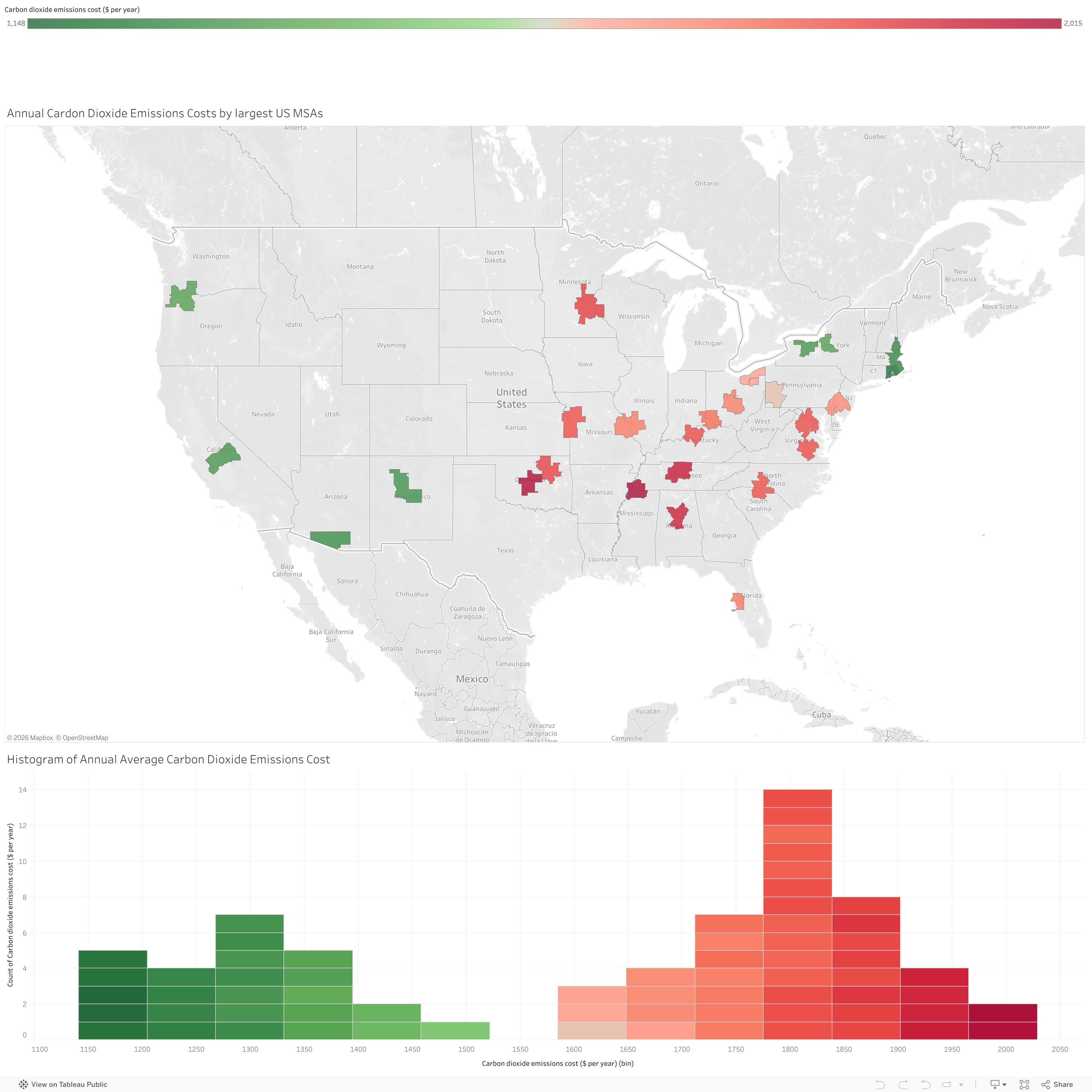
Map and Histogram show Annual Carbon Dioxide Costs by the top MSAs in the US. Details are shown for MSA Name and Annual Carbon Dioxide Cost. The data comes from The Vulcan Project
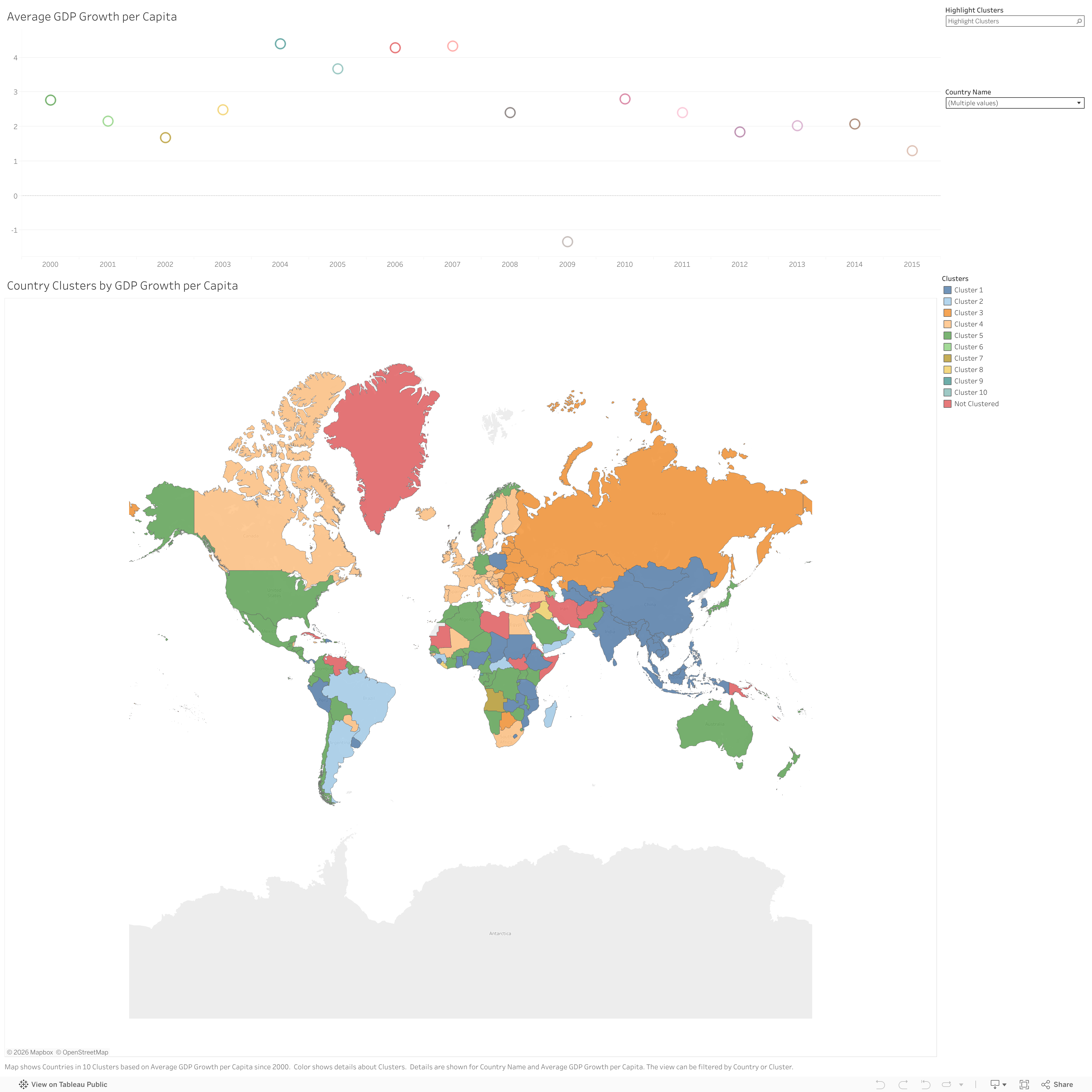
Map shows Countries in 10 Clusters based on Average GDP Growth per Capita since 2000. Color shows details about Clusters. Details are shown for Country Name and Average GDP Growth per Capita. The view can be filtered by Country or Cluster.The data comes from the World Bank
This visualization and dataset includes a record of the date, time, location, depth,
magnitude, and source of every earthquake with a reported magnitude 5.5
or higher since 1965. The data comes from Kaggle
The words in the Top 100 Songs, with filters for Artist and Song show how distinct and similar the greatest artists and songs are. The data comes from Makeover Monday
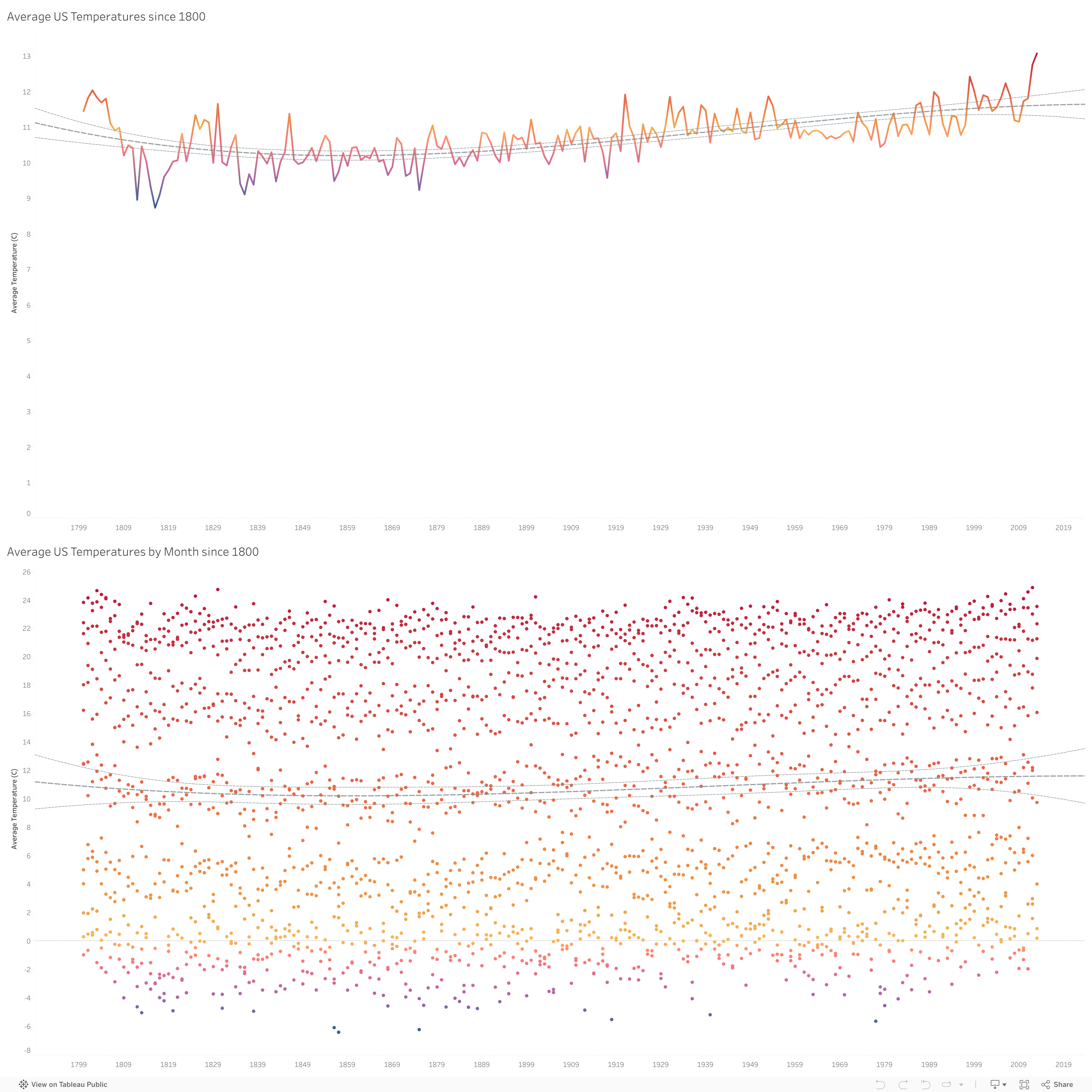
A rather sensational visual to start the year. A simple look at average temperatures (in Celsius) in the US since 1800. There is a polynomial trend line for the average, and you can make the obvious inference. This data comes from data.world using the Global Land Temperatures By City data, and filtered down to the US from 1800